Thursday, March 13, 2014


Senior art students from St. John's University visited BRAC today, and showed their work to students. Students then discussed the notion of 'Augmented Reality' in relation to their documentation of the Shattering Phenomena show with visitors.

TPS Winter 2014 - Lejend Beltran's photograph of graffiti taken in the Bronx was chosen as the face image for the brochure for the Teen Project Studio's Spring Semester.

Thursday, March 6, 2014


Example of a mind map we did, as part of the brainstorming process to design the tabs, and interface for our augmented reality Web site dealing with the show BRURAL:SHATTERING PHENOMENA.

Tab suggestions varied from standard: Contact / About / Home to Stuff You Don't Know / Sandy

We agreed on a more playful framework.

http://ar-brac.squarespace.com

It is in the proto-stage at this point, but we should be able to add significant content in the next few weeks.

Tuesday, February 11, 2014

the back piece to my earlier card simple and to the point
-michael w.


Invite Card Design by Ileamarys Mateo


I wanted to create an invite design where every artist has shown their perspective of the natural disaster and to bring them together  in one image formation to show the deeper effects of their impact while still keeping the show as interesting and mysterious as possible. 

Ileamarys Mateo 

Thursday, February 6, 2014


Back Flyer - The font is Just Old Fashion and the pictures is from the skies and one picture from space of the meteorite in Russia and the Super storm Sandy.


Front Flyer - The font is Just Old Fashion and the pictures are images of damage from the meteorite and hurricane sandy.
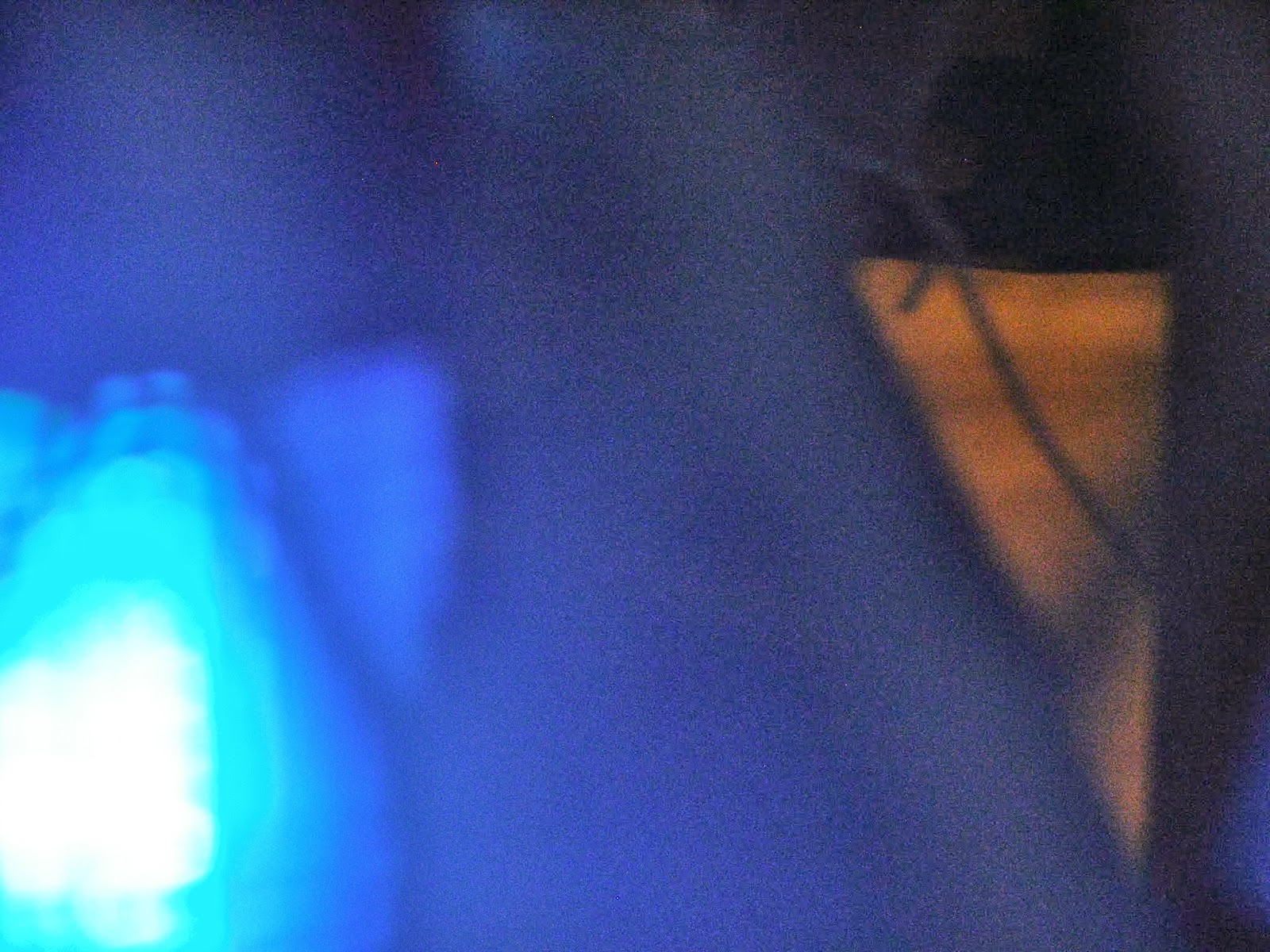
these are pictures i took with my camera. the B.R.AC. TPS kids when out on a walk around our area so that we can capture some pics that we would like to or wouldnt mind editing in photoshop my keen eye for shooting is to find different views on things i like to miss with focus and capture things that make you focus on them and their mostly things that you would pay no mind to. 


Michael .W - This is another possible invite to our special event featuring fiver performance artists being held on February 15, 2014. The style is this is meant to be more blunt, and graphically strong. That way it draws you to it.

Tuesday, February 4, 2014

INVITE CARD BY MICHAEL .W


I had to create an invite for performances for the BRURAL: SHATTERING PHENOMENA show on February 15. I put together basic info and classic image relating to the storm sandy and the meteorite in in Russia.

Another Prototype for the BRURAL: SHATTERING PHENOMENA performance night on February 15th.

Card Front - Top / Card Back - Bottom

I used Zapfino font for my writing. I went with multiple images of Hurricane Sandy and the Meteorite that happened in Russia. The font color is red, red is a color that stands out, it is a bold color. In the six images you will see the damage from the hurricane and the meteorite.

Additional Prototypes:


name - michael w

we were shooting in the park and when i take photos i like to catch the whats up closes to make u focus and i saw this simple little twig , i like to make the simple things and show its art . so here it is


Investigations of a Nearby Park by Ileamary


Prototype Card Design for Exhibition by: Rachel

We are attempting to investigate possibilities in graphic design for invitation cards for an upcoming night of performances as part of the BRURAL: SHATTERING PHENOMENA exhibition. The performances will take place on February 15th.